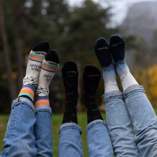
Socks might be just socks. But we all know better. And what better way to express your style than with socks? Fusakle, a cool Slovak brand, has some very exciting designs out there, and now, you can also get their limited edition with Outdoorchicks branding / design.
Settings
First, I want to share a few more details about this photo shoot. The goal was to get lifestyle photos with focus on the product - the socks. We had around ten pairs, three models and something over one hour of time. The weather was crap again with no direct sunlight. Very cloudy and right after a brief pouring.
Camera
I've used the "nifty nifty" 50mm f/1.8 lens and the camera was SONY A7. Luckily, I had the flash with a softbox this time with me and it was definitely worth it. Every photo was shot in .RAW (SONY .ARW) with automatic white balance. I knew I wouldn't get the typical autumn colors without the sun, but the flash with soft box and some tweaks later in photo editing did just fine.
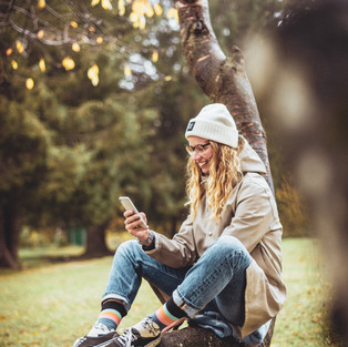
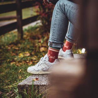
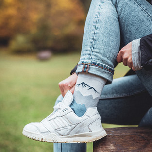
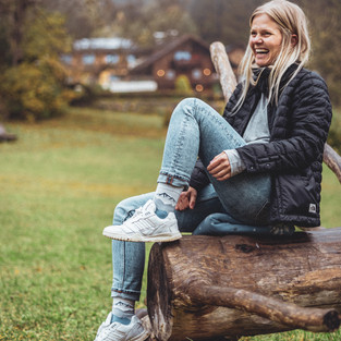
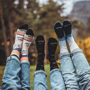
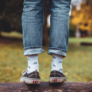
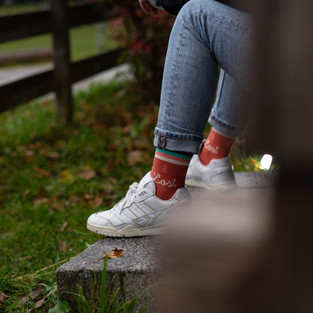
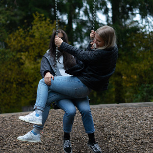
Here are the edited photos:
And here are the same photos, but before the edit:
What do you see?
Blue, yellow or red tint ? Let's find out. I'll be using the first photo as the example. Here it is again, before and after:
Also, I've uploaded the original photo in both .DNG and compressed .JPG format for you, so that you can download and follow along with the tips I am giving here. Or maybe add your own style and post your results in the comments?
Light
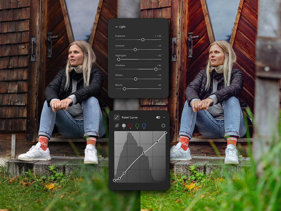
Here's the photo before and after the Light and Point Curve adjustments. Notice how the photo came to life. I find the increased color in socks and her skin tones oversaturated, but we'll address that later. I start with global adjustments like Exposure, Shadows, Highlights and then move to the Point Curve for a more precise local adjustments.
Exposure +1.03 I've used a flash with a softbox for this shot and this really shows its impact here. Increasing the exposure slider brings light evenly across the whole spectrum. Thanks to flash the photo was well exposed, which leaves little need for any radical adjustments here. But, I still have to be careful, and this time about the overexposed light hitting the face. I increase the exposure to the point of cheeks and forehead becoming too white.
Contrast -15 Decreased contrast gives me a more "flat" image with more freedom for my own adjustments.
Whites -13 This serves to set my base white point. I look out for the white shoes and the spots on the cheeks and forehead. I found the shoes to be a bit overexposed after the exposure adjustment. But that is better corrected with Highlights slider.
Highlights -92 Even though -92 decrease is rather strong it doesn't break the photo. I'll decrease the value by 92 and bring back the detail in the white overexposed shoes by doing this. However, I am not able to recover the whites on cheeks and forehead by doing this. I'll adjust it locally using the Point Curve later.
Shadows +81 Increasing shadows creates a more dynamic look. As if it had more tones of gray, clearer difference between dark and bright gray. This translate into higher dynamic range. Increasing Shadows however has a downside. It appears to have less contrast and looks more "flat". To counter this I use the slider Blacks and Point Curve. Sidenote: Dynamic range is one of the areas in which traditional large sensor cameras are worth the investment. They perform a lot better than smartphones as the larger sensor can capture many times more light.. Though Pixel 5a or the new Iphone 12 Pro push the limits of small sensor cameras to new levels.
Blacks -65 Blacks slider let's me counter the increased values of Shadows, Contrast and Exposure. It also creates a better looking contrast than the contrast slider as I am only making dark sections of the image darker. You could say that Contrast slider would also increase contrast. But this setting only increases contrast in dark areas. Contrast would also brighten up bright areas such as face, which I didn't want to as I did the exact opposite by decreasing Highlights value. Point Curve - I added a very slight S Curve adjustment. Point Curve is a very powerful tool and using it is a double edged sword. As this is a photo shot for a product a prefer not to go crazy with this adjustment. The goal here is not to polarize by creating a look that some find pleasing but some not.

However even a slight adjustment as this one does wonders. I'll guide you through every point on the curve. Let's start from the bottom left corner:
1. Bring the first point up along the Y axis. This removes the absolute dark blacks from the image by turning them into very dark grey. We're basically making every pitch black pixel slightly brighter.
2. Bring the second and the third point down along the Y axis. This makes dark shadows darker, yet not completely pitch black. Also creates more contrast in the dark areas of the photo. Move these points less than the point in the first step.
3. Create a fourth point in the upper right half. Don't move it, as it only serves to limit our adjustments in the next step.
4. Bring the fifth and sixth point down along the Y axis. This removes the complete whites, such as those on the cheeks and forehead , that we were not able to completely recover by using the Highlights slider above.
(If you're unfamiliar with Point Curve, Check out the previous post with explanation of Point Curves here)
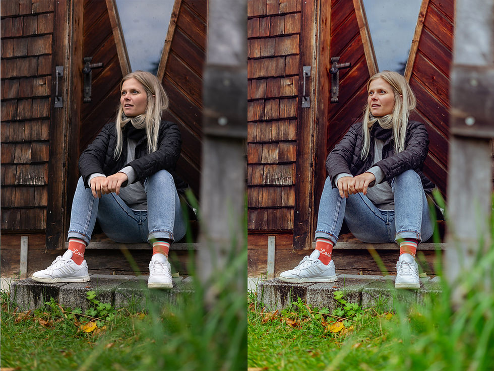
Color
In movies, there's this tendency to use three or five colors. The so called three color rule. The idea is to stick with mostly three to five colors in the frame, while having the dominant one the most attention. It's a cool idea that you can also apply to photos. I did the following here:

I identified three colors I wanted to stick with. Brown, red and green. All of them muted with only red being more vibrant because of the socks. But let's start with the global adjustments first.
Profile - Modern 08 I prefer this profile among millions provided by Lightroom. It mutes most colors and creates this flat look I prefer. Stick with standard adobe color if you can't decide which one suits you.
White Balance, Temp, Tint - As Shot Left unchanged with default values from camera. Very important as I've used a flash that can heavily change the colors if not properly adjusted. there is also an option for a Flash white balance setting in case you forgot about it during the shoot.
Saturation -30 I need to decrease overall Saturation and chose only specific colors to pop.
Vibrance +30 To bring back life to some muted colors form the saturation adjustment.

Color Mixer HUE left unchanged. Changes are already implemented by the Color Profile Modern 08.
Color Mixer Saturation Now back to the three color rule. I've decreased every colors' saturation with the global Saturation slider. I needed to make the red socks pop and the blue jeans and blue reflection in the window to disappear. So I've increased the RED and decreased the Blue. Other small adjustments are for the grass and the black/purple jacket.
Color Mixer Luminance Again very minimal adjustments. Decreasing the Blue's saturation left a very dark spots on the jeans so I've increased the luminance to counter that. Also the jacket appeared to bright so I've lowered the Purple's luminance as well.

Effects

Sharpening +42 I've used the nifty fifty lens from Sony, 50mm f/1,8 lens which has great center sharpness. I shot this photo at f/2.2. Unfortunately I did not have eye-autofocus turned on and I missed the focus by a bit. The camera locked on the hands and shoes, making face a bit out of focus.
It's Not tragic and I bet you haven't noticed up until now. Unfortunately there is very little what any software can do here. You can blur sharp areas artificially, but you can't make blurred areas sharp again. Again, it's barely noticeable here. I increase the sharpness by +42 and mask it with +94 Masking. Masking +92 makes sure, that only the edges of the in focus areas of photo are sharpened.
Noise Reduction +14 and Color Noise Reduction +29 are reasonable values to bring back down the noise from increasing shadows of the photo.
Texture +10 This increases detail and contrast in micro textures of fabrics and Logo on the socks.
Clarity +10 To bring back contrast in midtones / shadows.
Dehaze +11 To get rid of the light gray haze in the photo created by the increase of overall brightness.
Vignette -10 To focus on the model and the socks.
Grain +27 My personal preference to make the photo appear more natural.
Conclusion

Here's every step visualized. And while any of the these photos could be picked and used just fine, it's the little edits we did here that sums up to a much better results. I've attached the original photo here. So play around and figure out what is best for you.
As usual I have a few tips for you:
TIP 1: If possible, bring a flash, diffusor or reflector. And not only for bad weather. It makes a world of difference. This is a copy and paste from previous post where I did not have any flash with me. Do you see the difference here?
TIP 2: Think of the Colors and the three or five color rule. But make sure that it is fine for what you are doing.
TIP 3: Do the photo edit and let it be for a day or two. Then come back to your photos and see if you'd change something. I didn't have the idea with three colors for this photo the first time I edited.
Don't forget to check out the Outdoorchicks socks, or send them a direct message on Instagram. They have many different designs. Maybe there's one for you?
That's it for now, cheers.
Michal



















Comments