The beauty of Photo Editing:
Disclaimer: Photo editing is, and at the same time, isn't a rocket science. The truth is, most of us do it, by using simple, yet great Instagram filters. And we are happy with the results. Anyone can do it. So why waste so much time learning how to use these complex headscratching photo editing tricks and tools, you might ask. Well, I prefer to make my own style. I feel, as if I am creating the photo by editing it. And when I am done, it's as if I've taken the same photo, but twice. Photo editing makes your photos unique. If everyone uses the same Instagram filter, it makes your edits stand out even more. Now this guide, might seem counterintuitive then. I am telling you how to edit by using my own style as an example. It should then all make my photos no longer unique after all, right? but who cares? And, just like with any form of art expression, your results will be absolutely different than mine. You'll create your own style as you learn and progress. I am here writing this to help you, if I can do it, you can do it! And who knows, maybe you'll be telling others how to edit very soon. Good luck!

SO WHAT MAKES A PHOTO STAND OUT?
A great model I'd say. Like the one here. Can't get a great model? Go to a banger location. Can't get that either? Well, get a puppy then! Let me guess, you can't get that either, eh...?
But worry not! you can get away with all that. In my experience, it's what that happens in the editing software that makes the photo stand out. The edit. So let's find out! Oh, and I'll be using a great model and a banger location, sorry.


I choose to use Adobe Lightroom as the editing tool of my preference. However all the editing functions remain more or less the same throughout all of the Software available out there. Try to look for meaning behind the changing setting values and you will be able to apply the techniques explained here on any editing app.
So let's get to it, here are the three steps based on area of editing they cover.
Light
Color
Effects
STEP 1 - LIGHT
I start the edit by correctly adjusting the exposure, or light. I am using the word light instead of exposure, as "exposure" it's just a fancy word for light. But it did cause me headaches when I started, so here I'll use just Light. In technical terms, it relates to how much light reaches the sensor of the camera. How much of light that makes a photo. But, what is important, is to remember, that it simply defines whether the picture is dark - underexposed or too bright - overexposed.

Editing Light in Lightroom is very easy, it's like elementary school of photo editing. You move the points to either left or right. Either to increase or decrease the amount of light in different areas of the photo. So for this photo, I did the following adjustments:

Exposure +0.10 Exposure increases the photo's exposure/ light/ brightness. Every area of the photo is affected. This photo however, was well "exposed" so no radical change is needed.
Contrast -15 Contrast makes dark areas darker and bright areas brighter. It increases the contrast of all areas of the photo and allows very little control. I prefer to create contrast by adjusting blacks and highlights instead of a contrast slider. Default value is 0 But I decrease it to -15 to give me more freedom for my own contrast adjustments later on.
Highlights -100 As the name suggests, Highlights affect only highlight areas of the photo. In this case the clouds and the sky. I decrease Highlights very often to extreme values as I'd like to have more visible sky. Or in other words I use it to recover lost information in the sky. As a result, the photo also appears to have higher dynamic range.
Shadows +95 In the same fashion as highlights, I use shadows setting to recover hidden information in shadow areas of the photo. In this case however, I increase the value of Shadows to reveal more details of the darker areas on the photo. Here it's the climber, and the climber's equipment, the rope, shoes as well as the face.
Whites -10 According to Lightroom, Whites setting define what is the "whitest" point of the photo. As this photo is well exposed, we can see that the whitest point is clouds. They are clearly white as they should be. It means the photo is well exposed. There isn't much to be done here. But if the photo was extremely overexposed, and the clouds would appear grey, we would have to increase the white to match our desired whitest point of the photo. I suggest you first do white adjustments and then apply highlights adjustments. Remember though, Whites affect the photo globally, not just a specific are, like highlights do.
Blacks - 75 This is the ideal slider to counter our shadows adjustment to create pleasing contrast. Increasing shadows makes the photo "Hazy" as if some grey filter was applied. Decreasing the Blacks minimizes this, plus also creates a better looking contrast then the contrast slider. It does this by preserving the details that we brought up with Shadows adjustment.

Notice, that even though I only edited the Light with intention to reveal hidden information and detail, I ended up with an increase in color saturation as well. I will have to address this later in Step 2 - Color.
Lights/exposure adjustments are sometimes more than enough. I could stop right there, it's a solid edit. It's what happens, when you click on auto edit on iPhone for example. But I always want to add more. The next step is to edit Point Curves.
Tip : Remember! I can only do such strong adjustments to Light (shadows, highlights, etc.) because I shot this photo in RAW format. This allows me to do these adjustments without the photo falling apart into artefacts and noise. Adjust your edits to your photo formats. If you shot JPEG, don't overdo the edit. If possible, always shot RAW. Once you see the noise creeping in, stop.
Tip: I tend to underexpose my photos. I do this to save the photo's highlight areas. Highlights are for example the sky, the clouds or the sun. Remember the "-100 Highlights" adjustment? I know I can always increase the light/ exposure in the shadows later in the post processing, but what I can't do, is saving the sky or clouds if it was overexposed. No matter what I do in post, the clouds will most likely stay just white with no detail. I do this by setting the EV setting of my camera in minus values, from -0.3 to - 1.3 and shoot RAW.

CURVES

What makes point curve tool truly amazing, is that these little adjustments, actually create your "style"! But if editing shadows and highlights is elementary school, then editing curves is a PhD diploma. You have to accept that it will take time to master this, but once you do, you'll develop an instinctive feeling to it. And yeah, your life will never be the same!
But if you feel like this is too much to grasp now, skip this part and go ahead to part Color. I will create a separate post dedicated to Curves only.
Tip: I can't stress this enough. Always do minimal adjustments. Be very slow and mindful with the curve. Even a tiny movement of the points on the curve can have a huge impact on the photo.
S Curve

What you can see on the .gif above and the picture, is the adjustment of the point curve to a very common S shaped Curve. It's a powerful tool for multiple adjustments ranging from Light to Color Adjustments. Unlike many other tools, Point Curve's adjustments can be applied globally as well as locally.
I personally use the Point Curve adjustments to achieve:
1. Better Contrast - With more control then just a contrast slider. I can chose, which part of the image should be affected more, whereas contrast slider affects every part of photo.
2. Haze - I can add a natural Haze to a photo by removing absolute blacks. Although this is a personal preference. I don't think we ever should see something pitch dark black.
3. Hard to replicate look - By it's nature, it's a curve and a very hard one to replicate.

I did this very basic "explanation" illustration for you, o better understand the Point Curve mechanics.
Moving any point "x" of the curve UP, will
make that part of the image (dark, shadow or highlight tones) BRIGHTER.
or
Moving any point "x" of the curve DOWN, will
make that part of the image (dark, shadow or highlight tones) DARKER.

These are the adjustments to the RGB light tones of the photo. But wait! There's more.

A point curve for each individual color spectrum of RGB, that is Red, Green and Blue. This is also the point in the editing where you directly start to edit colors. Color Point curve, just like RGB Point Curve, changes colors locally as well as globally.
Color Point Curves work in the same sense as the RGB Light curve, but instead of making the photo brighter or darker, it changes the colors into opposite direction. Adobe Lightroom makes this very simple by showing you exactly which colors in the chart itself. It's handy to remember the factsheet:
Red is the opposite of cyan.
Green is the opposite of magenta.
Blue is the opposite of yellow.
So for the RED point curve:
Moving any point "x" of the curve UP, will
make that part of the image (dark, shadow or highlight) more RED.
or the opposite direction
Moving any point "x" of the curve DOWN, will
make that part of the image (dark, shadow or highlight) more CYAN.
The same follows for the remaining two colors with their respective opposite color. Again remember to be gentle with these adjustments. Treat it to locally change only a part of the photo, or move the Curve to apply the effect globally.
Example: If I want to add a cooler, colder feeling to the photo, then I move up the Blue Point Curve in the highlight section. Or the other way, do I feel I need to create even more powerful sunset cliché photo? Then I just move the Blue point curve down for both shadows and highlights. Of course it's a bit more complicated then that, as you have to be very careful with these adjustments, but once you get the feeling of it, you'll use it all the time. I'll dedicate an entire post to point curve later.
I tend to add Cyan, Magenta and Yellow to Darks and bit to Shadows, whereas to Highlights I blue and a small tint of green. I do this but adjusting the Red Point Curve and by adding Slight S Curves to both Green and Blue Point Curves.


Tip: Color Point Curve adjustments are probably the most subjective part of editing. A matter of taste. It's a never ending process of getting it "right" without having any "right" to begin with. Feel free to experiment, don't be scared, but always remember that less is more. Especially here.
STEP 2 - COLOR
A good practice for the right color correction is to first start with a vision. Take a look at a photo and think about what could be done here. What look / style do I want to achieve. What color is dominant. What is the dominant area of the photo?
When I look at this photo I see the trees and woods in the background take up a large part of the photo. They appear as a dominant element of the image. I don't like that very much. I did not care much for trees when I took this photo. It's a climber's portrait in Dolomites after all, it's about her and the tall towers of Cinque Torre. sure the trees make up the scenery as well, but They need to be subtle. They need to go with the rest of the tones here. Also a starting point here, are the trousers . They're a muted yellow. If only I could tweak the trees' color in that direction, that would be great.
See where I am going with this? Again this is my personal interpretation. Back to the edit.
As you might have already noticed, every Light / Exposure adjustment, be it simple shadows or mind bending Point Curves, affects the color as well. That is why I chose to do the Color edit as a Step 2, after the Light edit. I just hated seeing all my color tweaks and corrections be again changed with every light adjustments.
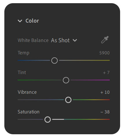
Saturation -38 Previous Light/Exposure adjustments increased the saturation. And not just by a bit, but a lot. I always lower the saturation as the first step of color adjustments. Remember that Saturation settings increases the saturation of every single pixel. Every single one. Increasing saturation is just one big NO. It works flawlessly as a tool to decrease the saturation though. I usually lower it anywhere between -30 and -40. This way, already subtle adjustment to any color is noticeable. Slight increase of yellow will go a long way with the lowered overall saturation. And remember, I want the trees, the dominant green color to shift towards yellow to match the trousers.
Vibrance +10 Vibrance on the other hand increases the saturation of only muted colors. However it does this globally, just like Saturation. If for example I wish to increase the saturation of the face or the red rope, I'd rather do it manually, because vibrance will also increase the saturation of trees. In this case I increase it by +10 and proceed to change individual colors manually.
TIP: As for the other adjustments I rarely adjust White Balance as I rely on the cameras capabilities to set the white balance. BUT, If in doubt, or impression that your colors have a weird offset, I recommend using the Lightroom setting for each environment settings. The range is similar to the camera setting from cloudy to sunny just like the camera. The same goes for Tint.

The decrease in saturation looks for some, well, just meh. Not exceptional. It's muted and no color stands out. That's because Saturation and Vibrance is again, a global adjustment. But I prefer these adjustments. I don't find the modern trendy oversaturated photos pleasing. High saturated photos combined with the fact, that most today's panels, from phones to TVs, are by default increased in Saturation, are nothing but a shortcut to make our eyes bleed. It's just too much color.
Also, I am now closer to my initial goal. The trees have lost some of its saturated colors and they no longer draw that much attention. I have two options now. Either I proceed with Color Mixer and tweak Hue, Saturation and Luminance of every color, or I pick color profile that changes colors globally.

Lightroom offers a metric shit ton of great profiles that you can choose from. From the very experimental ones from "Artistic" to more subtle from "Modern" or muted in "Vintage". I suggest you play around and see which one fits.
I am looking for the one that will shift the greens towards yellow. I found the Color profile "Modern 08" to do just that for me in this case. I leave the amount at the default value 100.
If the effect is too strong, especially on skin tones, consider decreasing the value.
It’s also possible to create your own customized color profiles using Lightroom. But that is getting ahead of ourselves.
Tip: Remember that color profiles affect every color in various amount. Again it is recommended to do this in the beginning or at least before the Color Mixer.
Let's see the difference between the Modern and Standard.

Now it's looking very good. The trees are no longing drawing my attention. I focus on the climber and the steep mountains in the background. However There are still some limitations I need to address. These are color specific, such as the washed out sky, or desaturated skin colors. For that I'll use the Color Mixer and its Hue, Saturation and Luminance adjustments.


Do you see it? The value numbers on sliders have changed so there has to be something! You know there is a difference, but's hard to identify what has changed at the first glance, right?
Lets go from the top, notice the sky. Lowering the Luminance, or in other words brightness of blue and increasing its saturation brings more colors and details in the sky. I also changed the hue of the sky towards cyan.
The blurred mountains in the back have a green tint. To eliminate that I increased the saturation of purple and magenta, the green's opposite and decrease their respective luminance. I also decreased green saturation just slightly. I left the rest of the green untouched as the woods are already covered by the "Modern 08" profile.
Now the climber. She is missing some natural saturated color on her face and the trousers are too washed out. I decreased the luminance of orange and yellow and increased the red's saturation considerably to make her more life-like. Careful not to affect the rest of the image too much.
Let's compare the colors with the original now.
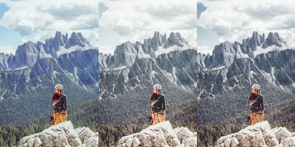
I leave the interpretation to you. Colors are, after all very subjective. No such nonsense as color science.
STEP 3 - EFFECTS
Effects are a tricky one and in this guide are the final step for a reason. These adjustments appear to be a very easy trick to make photos instantly better. But careful, what happens is more often the opposite.
Effects were created to correct photo's certain physical shortcoming. For example, if the lens used to take the photo was not the sharpest one, you would use "sharpening" to somehow correct it and still appear sharp. Or when the camera has few megapixels and the photo does have enough detail, you would use to "texture" to counter it. Or the other way around, when the photos are so perfect, that you would use grain, just to give it an older feeling look. Of course, all the scenarios are simplified.
The fact is though, that barely any modern camera has these faults. It's the opposite, smartphones have become so powerful that point-and-shoot compact cameras are thing of a past now. There is very little to worry about modern cameras' capabilities and photos' imperfections. Most of the lenses are so perfect that I personally find myself using an vintage lenses from back 1970s just to achieve the older "imperfect" look. And even those lenses are plenty sharp.
But let's go back to the edit. As with every adjustments, it's important to keep them minimal. Yes I know, I am repeating myself. But unless you want your photos to appear cheap, or as a badly done HDR or even worse, cause discomfort or straight blindness, then try to keep the effects low.

Texture +10 This photo, especially the climber has more than enough details in textures. I can clearly see the fine texture of the rope, details on the shoes, and even the vest's or helmet's brand. I don't need to add any more. Moreover, the effect is again applied globally and the last thing I want is more attention to the blurred trees and mountains in the background. It would be the exact opposite of what we did with the color adjustment.
Clarity +4 Exactly the same is true here here. The difference is, that Clarity adds texture detail and contrast. Again there is plenty of both here so is no need for more.
Dehaze +11 Dehaze is meant to add contrast to hazy looking photos. This happens often with landscape photos and distant objects due to the different air temperatures and amount of air. It is the case here and therefore I apply +11.
Vignette -5 Negative Vignette values are used to darken the photo's corners. Imperfect lenses create a natural vignette when the aperture is wide open f/1.8 for example. I don't need more than -5.
Grain +45 This one is a personal preference. Adding grain somehow makes me personally perceive the photo as more natural. Others don't. I Use grain in my edits to add that little extra, that makes them more pleasing to look at. I personally know photographers who dislike this look and avoid it as much as possible. As everything it all comes down to preferences.

DETAIL
Detail is the final step as well as optional. Many cameras, especially smartphones apply digital sharpening photos. Some less some more, extreme case is Huwaei. Over sharpened photo is not pleasing and increasing sharpness in most applications won't improve the image quality. A more advanced tool such as Adobe Lightroom however offers wider range of settings for Sharpening such as Radius or Masking to make their effect less apparent.

Sharpening +45 Intuitively, the higher the value the more pronounced sharpening effect. Although as high as the number appears, the range is between 0 and 150m with 45 being the default option.
Radius +1 Describes the size of the sharpening area around the edges. The default value of 1.0 means that Lightroom will apply sharpening over 1 pixel around the edge. I recommend keeping it at 1 - 1.5.
Detail +25 Defines which details are being sharpened. Minimal value of 0 would apply sharpening only to a very large object. Increasing the value will result in increased sharpness of smaller objects - e.g. more detail. I leave it at a default value 25.
Masking +94 Masking is the most important sharpening setting. It defines which areas specifically do get sharpened. The higher the value the fewer areas, the fewer edges get sharpened. To better understand the setting, Lightroom offers a great visual tool - Pressing "ALT" and moving slider either direction will reveal the affected areas. White highlight reveals the sharpened are.

As we can clearly see, the background is blurred, it is not the center of our attention, the climber is. There is no point to increase sharpness of out of focus areas of the image - the background. I set the masking the masking value to +94 to minimize sharpening only to the climber.
Noise Reduction +14 This heavily depends on the environment. If I shot in low light environment such as evening or night I have to apply more noise reduction due to higher ISO settings. I don't increase the noise reduction value as I do want to have noise in my photos. If I aimed for a more "perfect" photo I would want to avoid, and thus apply more Noise Reduction. +14 value is a very minimal and serves to smooth out imperfections.
Color Noise Reduction +25 . All of the adjustments happening in the edit, contribute to the creation of digital noise. The more changes we do, the stronger the effect. To counter this, I always apply a bit of Color Noise reduction. Again this does not apply to photos taken in a very dim lit environments.
CLOSING THOUGHTS
The edit:

Specs: Exposure +10, Contrast -15, Highlights -100, Shadows 95, Whites -10, Blacks -75, Points Curve adjustments, Saturation -38, Vibrance +10, Color Profile Modern 08,
Color Mixer, Texture +10, Clarity +4, Dehaze +11
Thanks for reading!
This is my first post. Hopefully, one of many to come. I have been trying to do this for three years. When I look back now, I am happy I did not make it three years ago! Because even now, while doing this post, I have learnt new things and improved again here and there. And who knows, maybe in the next three years when I look back I won't find these photo edits pleasing at all. But that is the point right? to do it and do it again and to get better.
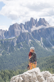
I hope you find this guide helpful, but if not, leave a comment or you know, don't. Here's a gallery of every step that I showed.
Special thanks to @Zuzana Galfyova for being the best and most patient model and my brother @Tomas Gajdos for the frequent exploit of his Camera. SONY a7 iii if anyone's wondering.
More post to follow, stay tuned at @howtoeditphoto and @fishsupreme
Cheers!
Michal







Comments